Saturday, March 30, 2013

New Brand - Company Documents

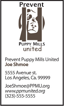
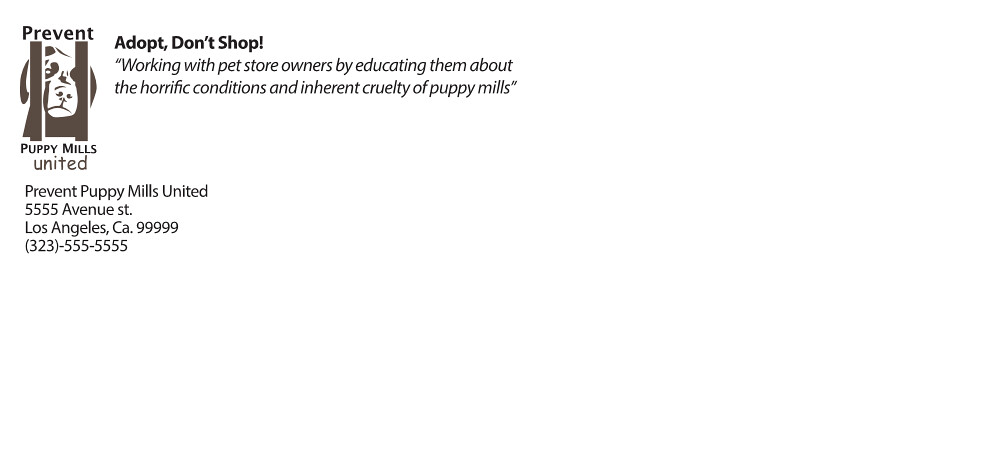
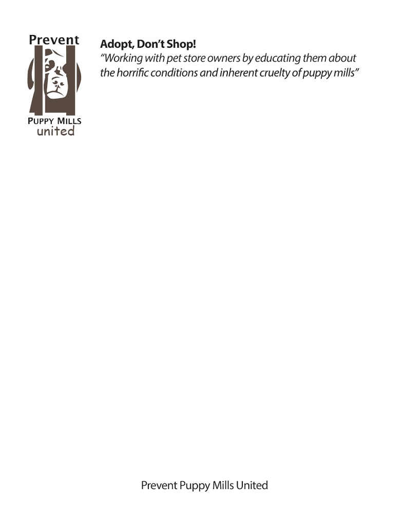
These four images are the first renditions if the Letter head, envelope, and business card for a company that works to stop Puppy Mills. The designs and color scheme are intended to be simple and strait forward. This allowing for the purpose of the company to shine. These images like the last series were made in a group project with Courtney Marie Eley and Chris Leohardt that I headed.  


Sunday, March 24, 2013

Company Identity

I am currently leading a group of three including me to create a company identity from the ground up. We decided to start of with a campaign. The campaign that we decided upon as a group was a campaign against "Puppy Mills." The project will start with a logo and company name. From this we will move on and design business cards, an envelope, and a letter head.

After this first step we will then need to develop a brochure, a poster, and a website. All of these will be posted at a later date. As of right now the company name we have decided on is "Prevent Puppy Mills United." Much of the inspiration for the companies identity will come from this poster:


Tuesday, March 19, 2013

Identity Project

Two classmates and I created a design firm that I am currently the head of. The first thing that we set forth to create was an identity. We achieved this by creating a logo, name, and overall design scheme. The three colors of the logo are our three favorite colors. Cosmos is an all inclusive word that can not be disputed as being unimportant. The font was chosen to be strong and show intensity through italicizing it and adding a spiral in place of the G. Overall I consider this collaboration to be a successful one. The first two images are of the front and back of the business card. The third is the envelope for mailing. The final image is of the letter head and footer.


Thursday, March 7, 2013

Superimposed Billboard


The assignment that this image was created for was a challenging one. I was to first design a poster for the motion of going green. Then I needed to place it in an image in a way that made it look like it was part of the original image. By stretching the image in a way to match the perspective lines of the semi, I was able blend it into the image effectively. 

Jazz Fest Poster

This image was created in Adobe Illustrator as a poster for the Jazz Fest in Miami that was canceled due to a lack of ticket sales. The image is meant to reference back to the style of poster that one used to see displayed everywhere. When designing this poster I chose elements that are seminomas with Jazz and the area of Miami.

Facebook Cover

The above image is a cover that I created from a color project that I turned grey scale. The original project was to use one shape and repeat and overlap it in order to create an interesting piece. The shape that I chose was two equal-lateral triangles of different sizes connected at the edges. Even as a grey scale piece it still holds a lot of visual interest.